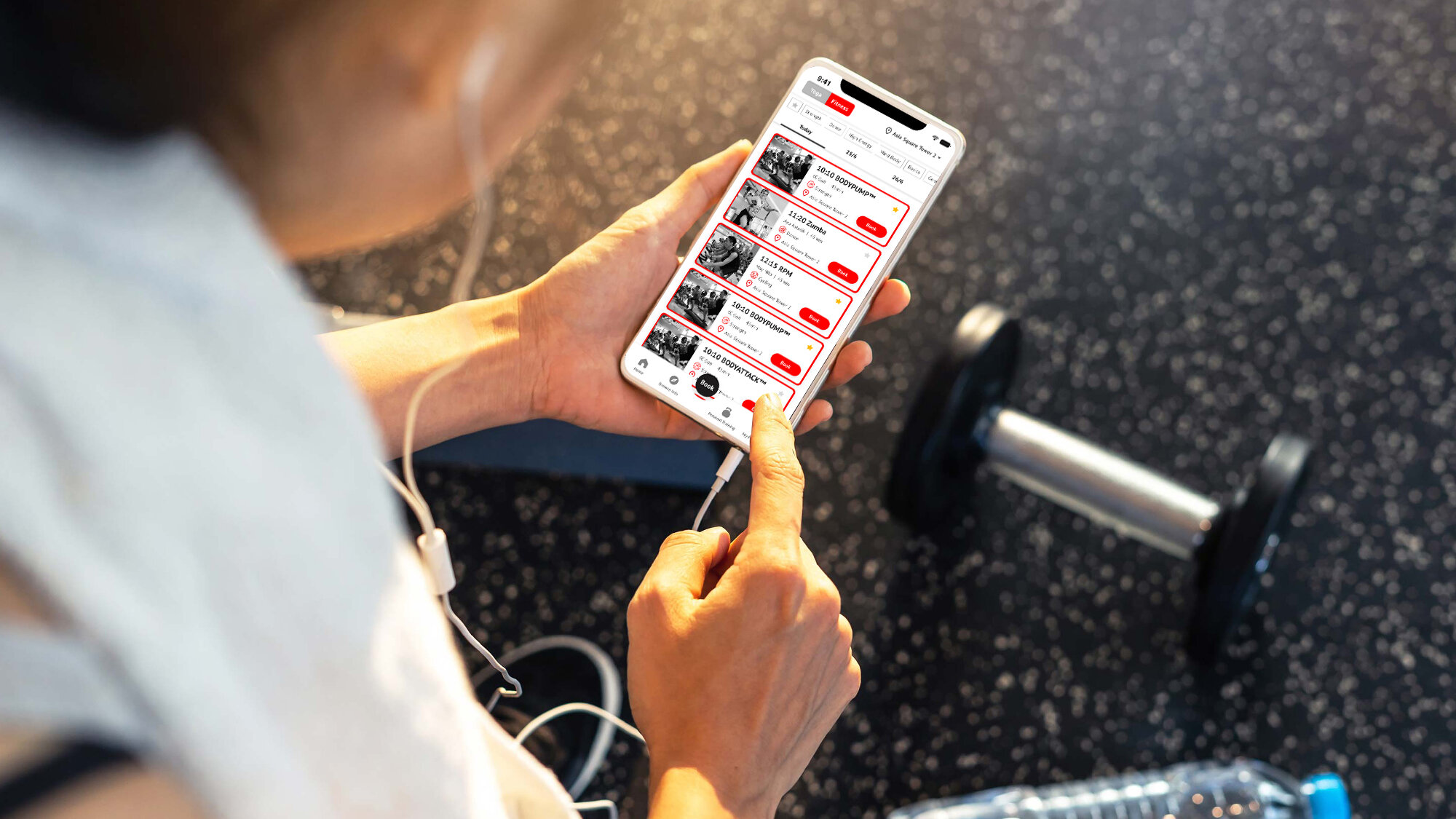
Pure 365 lifestyle app Reimagined
I’m a fitness enthusiast and I’m an active member of pure fitness/yoga, Pure 365 Lifestyle is the app that I have been using every day. This app does its job but I always thought that this app could be better⏤ like so much better.

The Challenge
This app has a clear purpose to use. Book a class / Studio check-in. To make this app, even more, stand out, I want to personalize the app experience for each user. Giving users a customized class booking/ browsing experience using its data will keep them coming back for more and make them invest more in this app.
On-Boarding 1
For the first-timer, Users can simply evaluate their level and select interests on the on-boarding journey.
On-Boarding 2
Users also can connect their wearable devices. This journey makes the user easily set a fitness goal and recommend classes based on their level and interest. This will help to shape the user’s interests and motivate them to participate in classes.
Booking Status
Before:
Rotating class carousel banner
Large promotional space/ Taking up too much space
promotion links lead to out of the app
promotion banners are left and right scrollable which is not so clear
After
Use tab to check on classes. Always display the upcoming class first. and no auto-rotating.
We show class recommendations over promotions.
Class Detailed page
Full-size detail page with the back button. and link to the auto filtered class booking page so no more overlapping booking function on this page.
Dashboard
By providing rich interactive dashboards, This helps users set their fitness goals, measure the performance. There are also rewards if users are able to achieve our goals.
Pitched Ekino 2019
Validate
To validate my prototype, I conducted usability tests with five people and saw how many users were able to complete the tasks without feeling the pain points.


